By Jake Bibby
In celebration of FilmDoo’s poster competition, what better way is there of stirring those creative juices than by bringing forth some of the most authentic film posters to have ever been conceptualised. Yet, before doing so, allow FilmDoo the liberty of taking you down the briefest of historical trails. The year is 1959, the country is Cuba, and under the guidance of Fidel Castro, revolution is in air; a period of socio-political change is sweeping across Cuba. Shortly after the success of the revolutionaries overthrow however, came the creation of the Cuban Art Institute of Cinematography (ICAIC). Perhaps unbeknown to its creators at the time, this institute would go on to provide the perfect platform for a new generation of artists, able to explore their own artistic interpretations of cinema.
As the like of Franciszek Starowieyski, Jan Mlodozeniac and Jan Lenica began to garner international acclaim for their individualistic takes on popular films posters towards the end of the sixties, Cuba was also readying itself to contribute in the same fashion. For every Starowieyski, Mlodozeniac and Lenica, Cuba had the likes of Eduardo Muñoz Bachs, Antonio Perez (Ñiko) and René Azcuy Cardenas. Admittedly, these Cuban artists were never afforded quite the same international notoriety as their Polish counterparts, yet this did not limit each individuals utterly striking artistic merits. Lets take a look!
If it were not for the concept of nepotism, maybe the world would have never been graced with the art of Eduardo Muñoz Bachs; yet thankfully we were. Already firmly established within the realm of graphic design at the tender age of sixteen, Bachs was asked to work for Cuban national television as an animator. One year before the Cuban revolution, and two years before his work at the aforementioned ICAIC, Bachs time as an animator undoubtedly had a profound effect on one of Cuba’s adopted sons (he was in fact born in Valencia, Spain). However, it wasn’t until he began working at the ICAIC after the 1959 revolution that he began to produce his iconic film posters, some of which can be seen below.
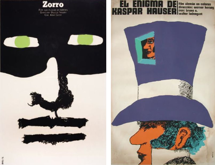
Here we can see how Bach devised himself a visual set of traits. Bachs palette was not cluttered with an abundance of colours; instead he only used four to five colours, sometimes even less. Despite the minimal use of colours however, the colours Bachs did use were vital, affording the image energy, despite their somewhat basic appearances. The facial details of Zoro and Kasper Hauser are sacrificed, yet the vibrant purple of Hauser’s hat and the green of Zoro’s eyes still give the posters presence.
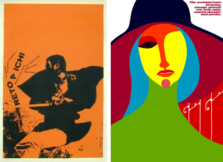
In his adaptation of the Vincente Minnelli 1958 release Gigi; Bachs again uses a limited palette, yet the contrast between the colours are extreme. With elements of surrealism, this poster is almost ceramic like in it’s shaping, deviating from the animation-based approach shown in the posters above. Clearly, Eduardo Muñoz Bachs was an artist who had developed his own style, yet he also managed to navigate his own parameters in order to keep his work both innovative as well as visually alluring. Further examples also make for interesting viewing. Bachs also highlighted his deft use of typography in this poster for Zatoichi Challenged (1967). Arranging both the title of the film as well as the cast and directors names at an angle seems as if they have fallen victim to the very sword of Zatoichi themselves. The poster itself embodies the themes prevalent in the film almost through a visual language.
As with Eduardo Muñoz Bachs, Antonio Perez (nicknamed Ñiko) was also a close associate of the ICAIC, yet he had studied the arts extensively before his employment at the ICAIC. Like Bachs, Ñiko was also quick to establish his own visual style when tasked with the opportunity to create film posters, yet before he had begun to take such commissions; he was applying his artistic endeavours to more socialist and propagandist content.

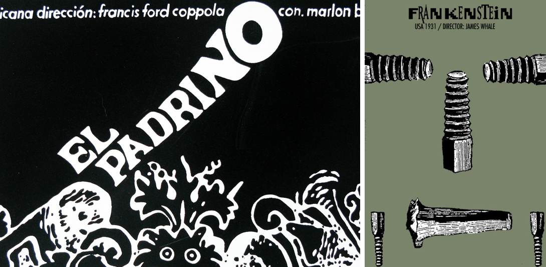
As can be seen in Ñiko’s design for Frankenstein, he had a very acute compositional talent. By not depicting Frankenstein himself, but just the bolts that have come to represent Frankenstein, Ñiko’s poster both generates intrigue for prospective viewers without compromising any of the films actual on screen horrors. On the left, we can see Ñiko’s offering for The Godfather. Once more, the design and colour usage is minimal (well, it is black & white). There is no mention of the cast and again, the typography is unconventional, both in style and its placement.
Our third and final artist to fall under the FilmDoo spotlight is another disciple of the ICAIC, René Azcuy Cardenas. What becomes apparent almost immediately when faced with the works of Cardenas is his emphasis on sections of the human form. Both Cardenas’ posters for Stolen Kisses (1970) and John Huston’s 1962 release Freud make the lower half of the human face the focal point for each of the posters.
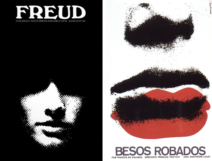
Both posters highlight a hallmark or Cardenas’ work, extensive use of black and white. The closed mouth on both of the posters also hints at themes of silence, contradicting one of the very virtues of cinema itself. Having witnessed and lived through a revolution, it is no surprise that the posters of Cardenas contain a sense of human drama.
It could be argued that the very essence of film, the power of the moving image, lies in direct conflict with the still image. Therefore, when designing a poster, the possibilities are endless. The way in which themes from certain films can be transposed to film posters are always open to personal interpretation. The ICAIC, was in itself established in order to promote socialist, and later, communist ideologies, in which the art of Cardenas, Bachs and Ñiko served as the vehicle. Perhaps each of their experiences when creating art to carry political messages ultimately helped shaped how they would in fact create film posters. Think; when designing your posters, what does it say about you and your personal experiences. Get designing all!
Create your poster with FilmDoo here

